
In the modern business world, data is everywhere—but insight is rare. Business owners and finance professionals alike struggle to find clarity in the endless flood of numbers, reports, and spreadsheets. Fortunately, visualizing finance can solve this problem by turning raw figures into meaningful, accessible, and actionable insights. Through effective use of dashboards and financial charts, decision-makers can gain a clearer picture of their performance, make better-informed decisions, and create a healthier financial future.
Whether you’re a solo entrepreneur, a startup founder, or a CFO in a growing company, harnessing the power of visual finance tools isn’t just helpful—it’s essential.
Why Visual Data Matters in Finance
Let’s start with the truth: most people’s eyes glaze over when they see an Excel sheet full of numbers. Even seasoned professionals can miss trends or anomalies when they’re buried under layers of line items. But visuals? They engage the brain differently. Visuals tell a story.
Cognitive research shows that humans process visuals up to 60,000 times faster than text. That means a well-designed graph can highlight a problem or opportunity long before it becomes visible in the numbers. By visualizing finance data, you’re not just looking at numbers—you’re interpreting behavior, anticipating change, and adjusting strategy.
For example, imagine spotting a steady month-over-month drop in website conversions. In a spreadsheet, you might miss it. But in a line graph, the decline becomes obvious, prompting faster intervention.
Visual data also improves communication across departments. Your marketing team might not understand your balance sheet, but they’ll quickly grasp a simple visual that shows how customer acquisition costs are rising while profit margins shrink.
Types of Financial Charts That Make a Difference
Not all charts are created equal. Each chart type serves a unique purpose, and using the right one can make your message significantly more impactful.
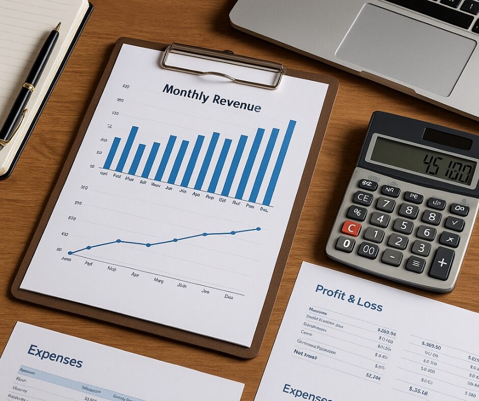
- Line Graphs: Perfect for showing trends over time. For example, tracking monthly revenue or customer churn over a year gives immediate visibility into business momentum.
- Bar Charts: Ideal for comparisons. You can compare departmental spending, regional performance, or sales by product type with quick clarity.
- Pie Charts: Best used to show proportion. If you’re analyzing how expenses are distributed—like payroll, marketing, and operations—pie charts offer a snapshot of the breakdown.
- Stacked Area Charts: These give insight into cumulative values over time and are excellent for understanding how various income streams contribute to total revenue.
- Heat Maps: Visually highlight the intensity or frequency of data points. For instance, identifying which days of the week bring the most website traffic or which sales reps consistently outperform can be instantly clear with this format.
The key is context. A chart should be used when it clarifies something specific, not just to add design flair. Less is more—focus on delivering one clear insight per chart.
Dashboards That Drive Smart Decisions
Dashboards bring your financial visuals together into one cohesive hub. But a dashboard isn’t just a place to view data—it’s a dynamic decision-making tool.
Think of your dashboard as your business’s command center. The best dashboards do three things:
- Summarize: They consolidate large amounts of data into digestible formats.
- Highlight: They draw attention to the KPIs that actually move the needle.
- Adapt: They’re customizable so you can focus on what matters most for your current goals.
For example, a startup might need to track runway and burn rate. An established company might be more concerned with gross profit trends, AR aging, or revenue by segment. A dashboard that evolves with your business is one that supports your growth.
If you’re managing a team, dashboards are also fantastic alignment tools. Everyone can look at the same numbers and work from the same truth. No more siloed decision-making or guessing.
Tools and Platforms That Simplify Everything
Once upon a time, building dashboards required a team of developers and an IT budget. Thankfully, that’s no longer the case. Today, there’s a range of powerful, user-friendly tools built for people like you and me.
Here are a few platforms worth exploring:
- Google Looker Studio (formerly Data Studio): Free and integrates seamlessly with other Google products like Sheets and Analytics. Great for small businesses just starting out.
- Microsoft Power BI: A favorite in corporate settings, this tool is powerful and customizable, with strong data modeling capabilities.
- Tableau: Known for beautiful visuals and interactivity, Tableau is perfect if you’re dealing with complex data from multiple sources.
- QuickBooks Online + Fathom or Syft: If you’re already using QuickBooks for accounting, add-ons like Fathom or Syft let you build visual reports and dashboards effortlessly.
- Notion + Charts API: Want lightweight visuals embedded in your daily workflow? Combine Notion with simple chart integrations for goal tracking and basic financial health metrics.
These tools don’t require technical expertise. Most offer drag-and-drop functionality, prebuilt templates, and step-by-step guidance. You can get something working within hours, not weeks.
Avoiding Common Visualization Mistakes
Visuals are powerful—but only when done right. A cluttered, poorly designed chart can actually create confusion rather than clarity.
Here are the most common mistakes to avoid:
- Overloading with Data: Don’t try to show everything at once. Stick to 3–5 key metrics per dashboard or visual.
- Inconsistent Formatting: Use consistent color coding, font styles, and layout. This reduces cognitive load and makes interpretation easier.
- Poor Chart Selection: Pie charts with too many slices, bar charts that don’t start at zero, or line charts without clear time intervals can all distort the message.
- Lack of Context: Always label your visuals. Show timeframes, units of measurement, and data sources when applicable.
- Neglecting Mobile Usability: If your team checks dashboards on mobile, make sure everything is readable and scrollable on smaller screens.
Keep your audience in mind. Your visuals should answer the question they’re asking—before they even ask it.
How I Use Visual Dashboards in My Business
Let me give you a behind-the-scenes look at how I personally use visual dashboards.
Every Monday morning, I review a simple dashboard that shows:
- My revenue by source (products, services, affiliate income)
- Weekly ad spend and ROI
- Website traffic compared to conversion rate
- New leads vs. email unsubscribes
This dashboard lives in Looker Studio and pulls from Stripe, Facebook Ads, and my CRM. It takes me 10 minutes to check, and it sets the tone for the entire week.
I’ve caught issues—like rising ad costs with flat conversions—within days, not weeks. That kind of speed lets me adjust strategy before it costs me real money. On the flip side, I’ve also spotted successful patterns and doubled down quickly.
This one habit alone has made me more confident, more efficient, and more data-driven. And the best part? I don’t dread reviewing my finances anymore. I actually look forward to it.
Final Thoughts
Visualizing finance is more than just making charts look pretty. It’s about unlocking clarity, speeding up decisions, and creating alignment across your team. It’s a strategic advantage that every business—regardless of size—can and should leverage.
Start with just one dashboard. Choose a few key metrics that matter most, and set up a system to track them visually. Once you do, you’ll wonder how you ever lived without it.
Because in business, seeing is not only believing—it’s thriving.