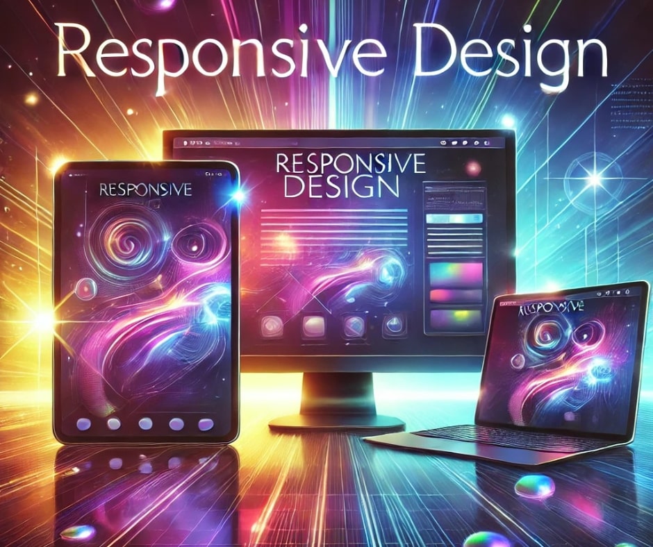
In today’s fast-paced digital age, ensuring your website meets the expectations of users across all devices is non-negotiable. Responsive design in digital marketing has become a cornerstone of online success, directly influencing user experience, search engine rankings, and conversion rates. When every pixel matters, responsive design bridges the gap between functionality and accessibility.
What Is Responsive Design?
Responsive design refers to the practice of creating websites that automatically adapt to the screen size, orientation, and platform of the device being used. Whether a visitor uses a smartphone, tablet, or desktop computer, the website remains seamless and user-friendly. By incorporating flexible layouts, scalable images, and CSS media queries, responsive design delivers consistency.
Why Responsive Design Is Vital for Digital Marketing Success
- Enhanced User Experience: Visitors stay longer on websites that are easy to navigate and visually appealing. A positive experience boosts engagement, ensuring your audience takes desired actions like signing up or making a purchase.
- Improved Search Engine Rankings: Search engines like Google prioritize mobile-friendly websites in their algorithms. A responsive design directly contributes to better SEO performance, increasing visibility and organic traffic.
- Higher Conversion Rates: A seamless journey across devices reduces friction, leading to higher conversion rates. Prospects are more likely to trust and interact with brands that prioritize convenience.
- Cost and Time Efficiency: Rather than creating separate sites for desktop and mobile users, a single responsive design saves development time and reduces costs. Maintaining one site is far more efficient.
- Adaptability to Future Devices: Technology evolves rapidly, and responsive design ensures your website remains functional across emerging devices without significant updates.
Steps to Implement Responsive Design
- Prioritize Mobile-First Design: Begin with the smallest screen size and scale upward, ensuring a flawless experience on every device.
- Use Scalable Images and Fonts: Adapt visuals and text to fit any screen seamlessly.
- Test Across Multiple Devices: Simulate user experiences on smartphones, tablets, and desktops to identify and resolve issues.
- Optimize Loading Speed: Compress images, leverage caching, and minimize code to enhance performance.
- Leverage CSS Media Queries: Use CSS rules to adapt layouts dynamically based on screen dimensions.
The Business Case for Responsive Design
Ignoring responsive design in digital marketing can have consequences that range from lost customers to missed opportunities. Businesses that embrace this approach often see higher engagement, lower bounce rates, and better customer retention. With over 50% of web traffic originating from mobile devices, the stakes have never been higher.
In conclusion, responsive design in digital marketing is not just an option—it’s a necessity. By prioritizing adaptability and accessibility, businesses can create a digital presence that resonates with today’s audience while preparing for tomorrow’s challenges.


